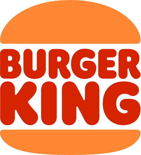
Logo Design & Branding
Defining the Visual Image of your Business
Logo Portfolio
LOGO FUNDAMENTALS
Unleashing the Power of a Logo
What’s the secret behind a great logo? It’s a potent blend of simplicity, adaptability, and relevance. It’s more than just a design – it’s the heartbeat of your brand.
Simplicity | The Art of the Essential
What’s the secret behind a great logo? It’s a potent blend of simplicity, adaptability, and relevance. It’s more than just a design – it’s the heartbeat of your brand.
Think of simplicity as the secret sauce that makes a logo instantly recognizable yet eternally memorable. It strips away the noise, leaving behind only the essential elements that embody your brand. This minimalist approach crafts a logo that’s not just visually pleasing, but also deeply ingrained in the minds of your audience.
Versatility | Master of All Mediums
The true test of a logo’s mettle lies in its versatility. Be it on a business card or a towering billboard, a top-notch logo maintains its allure. Experience how these logos hold their own across platforms and formats.
Imagine your logo on a tiny mobile screen, then on a colossal billboard. Does it retain its appeal? If yes, you’ve achieved versatility. This chameleon-like quality ensures your logo adapts to its environment without losing its essence, making it a timeless asset in your branding toolkit.
Relevance | Standing Out in the Crowd
A powerful logo resonates with your industry, your business, and your audience. Marvel at how these logos mirror their brands with poise and precision.
When your logo reflects the soul of your brand, it speaks directly to the hearts of your audience. It becomes more than just an image; it’s a statement that resonates with those who share your values and aspirations. A relevant logo is the bridge that connects your brand to the world.
LOGO STYLES
Picking the Perfect Logo Style
Your logo’s colors are the paintbrushes that color your brand’s personality. Here’s a vibrant overview of what different hues can convey.
Wordmarks | Showcasing Your Name
Ideal for businesses with distinctive names, wordmarks use customized typography to put your brand name front and center.
• Examples: Coca-Cola, Google
• Best for: Unique business names.
*These logos are shown for example only. Cloud Mountain Graphics is in no way affiliated with these companies.
Lettermarks | Sleek and Abbreviated
When your business name is a mouthful, lettermarks save the day by elegantly abbreviating it.
• Examples: IBM (International Business Machines Corporation), NASA (National Aeronautics and Space Administration)
• Best for: Long business names
*These logos are shown for example only. Cloud Mountain Graphics is in no way affiliated with these companies.
Brandmarks | Icons that Speak Volumes
• Examples: Apple, Instagram
• Best for: Well-established brands
*These logos are shown for example only. Cloud Mountain Graphics is in no way affiliated with these companies.
Combination Marks | Double the Impact
• Examples: NBC, Burger King
• Best for: New or evolving businesses
*These logos are shown for example only. Cloud Mountain Graphics is in no way affiliated with these companies.
COLOR THEORY
Painting Your Brand's Personality
Your logo’s colors are the paintbrushes that color your brand’s personality. Here’s a vibrant overview of what different hues can convey.
Your Brand | A Symphony of Elements
A logo may kickstart your brand’s journey, but there’s more to a brand than meets the eye. At Cloud Mountain, we orchestrate a symphony of typography, color palettes, imagery, and more to compose a brand identity that echoes your uniqueness for years to come.